




Shy Stores
Fashion shopping, made simple.
A public website for Shy Stores — a clean fashion e-commerce storefront with category-led shopping, new arrivals, best sellers, product discovery and policy pages in one polished customer journey.
Every page at a glance.
Click any screen to open it full size.
A Fashion Storefront Built For Browsing
Shy Stores needed a public website that could present its fashion catalogue clearly, guide shoppers into the right collection, and make the path from discovery to purchase feel calm and direct.
We built a focused fashion e-commerce experience around the way customers actually browse: category pages for dresses, blouses, pants, skirts and sets, a New Arrivals surface for fresh drops, a Best Seller path for high-intent shoppers, and a clear refund policy for trust.
- A storefront that makes the collection feel curated and easy to scan.
- Dedicated category pages for the main product families.
- Discovery paths for new arrivals and best-selling products.
- Policy content that supports trust before checkout.
What Was Holding The Brand Back
A fashion catalogue can lose momentum when everything feels flat, uncategorized or unclear. Three gaps needed to be solved for shoppers.
Customers needed clear routes into the collection instead of browsing a generic product list with no strong category structure.
New drops and best-selling pieces needed their own surfaces so high-intent shoppers could move quickly toward the right products.
First-time shoppers needed visible policy information, especially around refunds, before feeling confident enough to buy.
One Clean Public Shopping Experience
We shipped a single public website that organizes the brand around how shoppers think: browse by product type, check new arrivals, discover best sellers, and confirm the store policy without breaking flow.
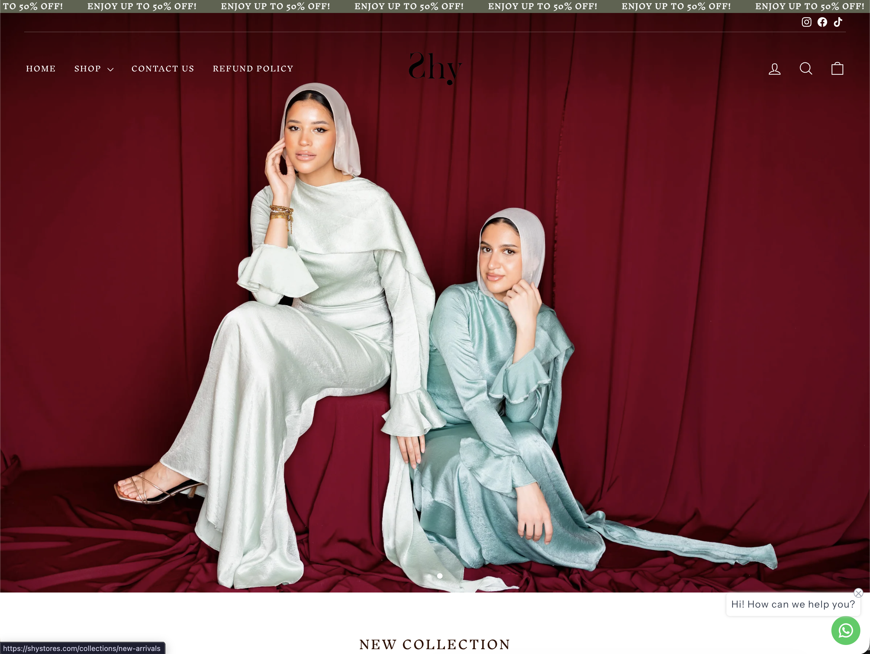
A polished public home that introduces the brand and moves shoppers directly into the catalogue.
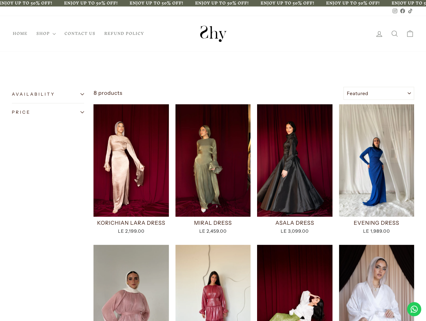
Dresses, blouses, pants, skirts and sets are split into clear category pages for faster browsing.
Dedicated discovery paths highlight fresh drops and the products shoppers are most likely to trust.
A clear refund policy gives customers the practical details they need before checkout.
Every page, explained.
9 surfaces inside shystores.com — each one a page we designed, built and shipped on the live site.
Home / Storefront
The public storefront opens with a fashion-led shopping experience that quickly introduces the collection, seasonal highlights and the main paths into product discovery.
- Fashion-first homepage presentation
- Immediate access to key collections
- Clear shopping routes for returning customers
- Responsive public website experience
Dresses
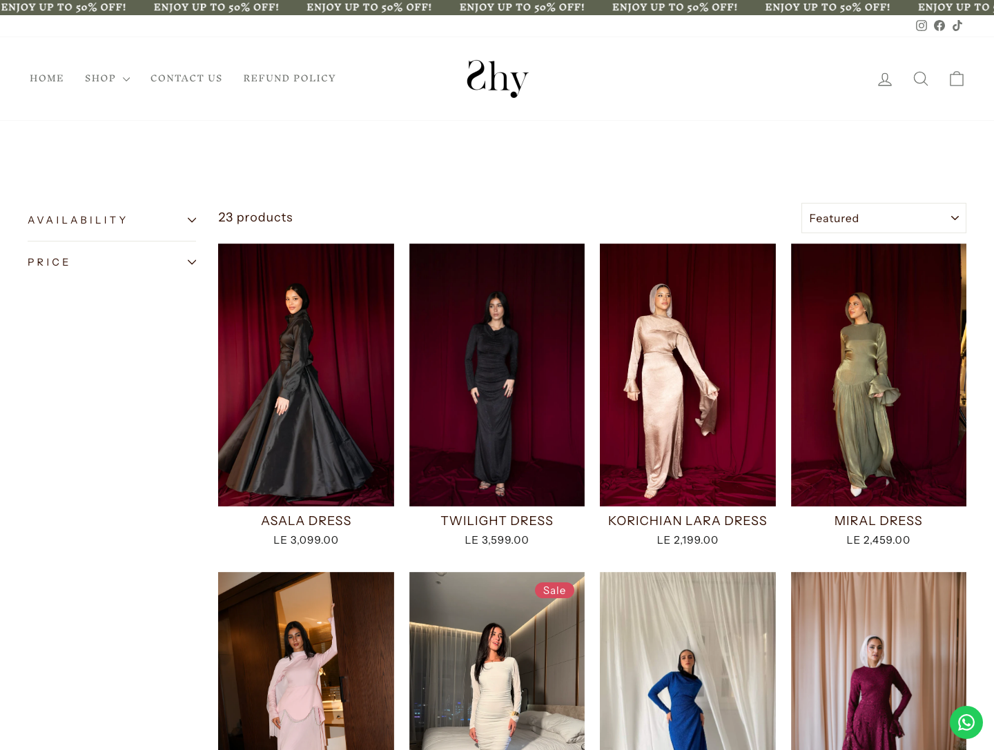
A dedicated Dresses category gives shoppers a focused way to browse one of the brand's core product lines, with clean visual scanning and direct product access.
- Category-led product browsing
- Large product imagery for quick comparison
- Consistent card structure across the catalogue
- Direct path from category to product detail
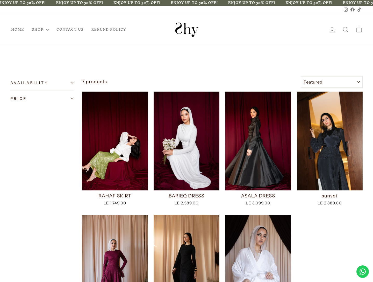
New Arrivals
The New Arrivals surface keeps the storefront fresh and gives repeat visitors a simple reason to return and discover the latest drops.
- Latest-products collection page
- Fast browsing for repeat shoppers
- Merchandising space for seasonal launches
- Clear visual rhythm for product discovery
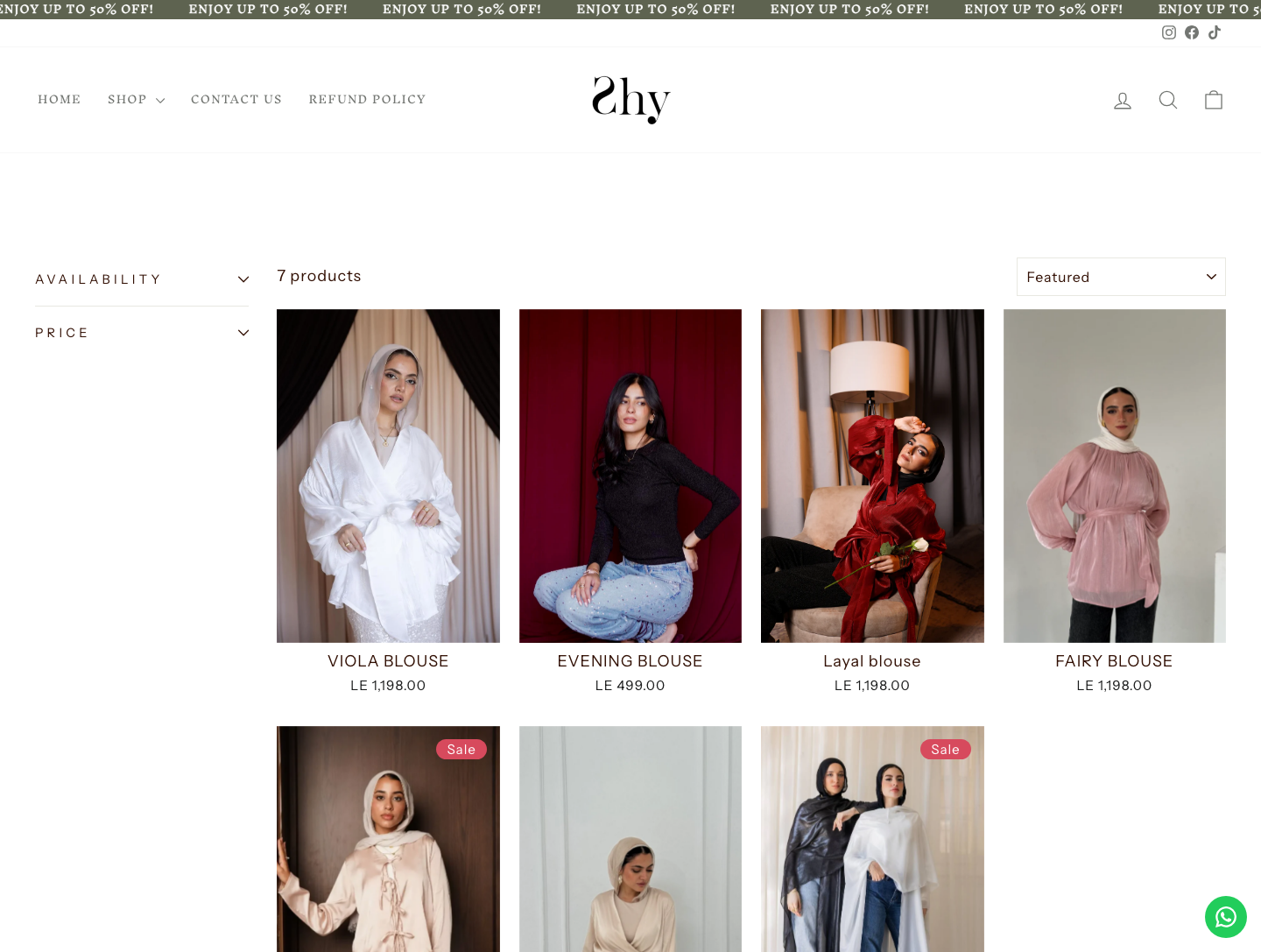
Blouses
The Blouses category keeps the catalogue organized around how customers naturally shop, making the site easier to scan and easier to maintain.
- Dedicated category landing
- Consistent product-grid treatment
- Simple filtering-by-interest through navigation
- Reusable collection layout
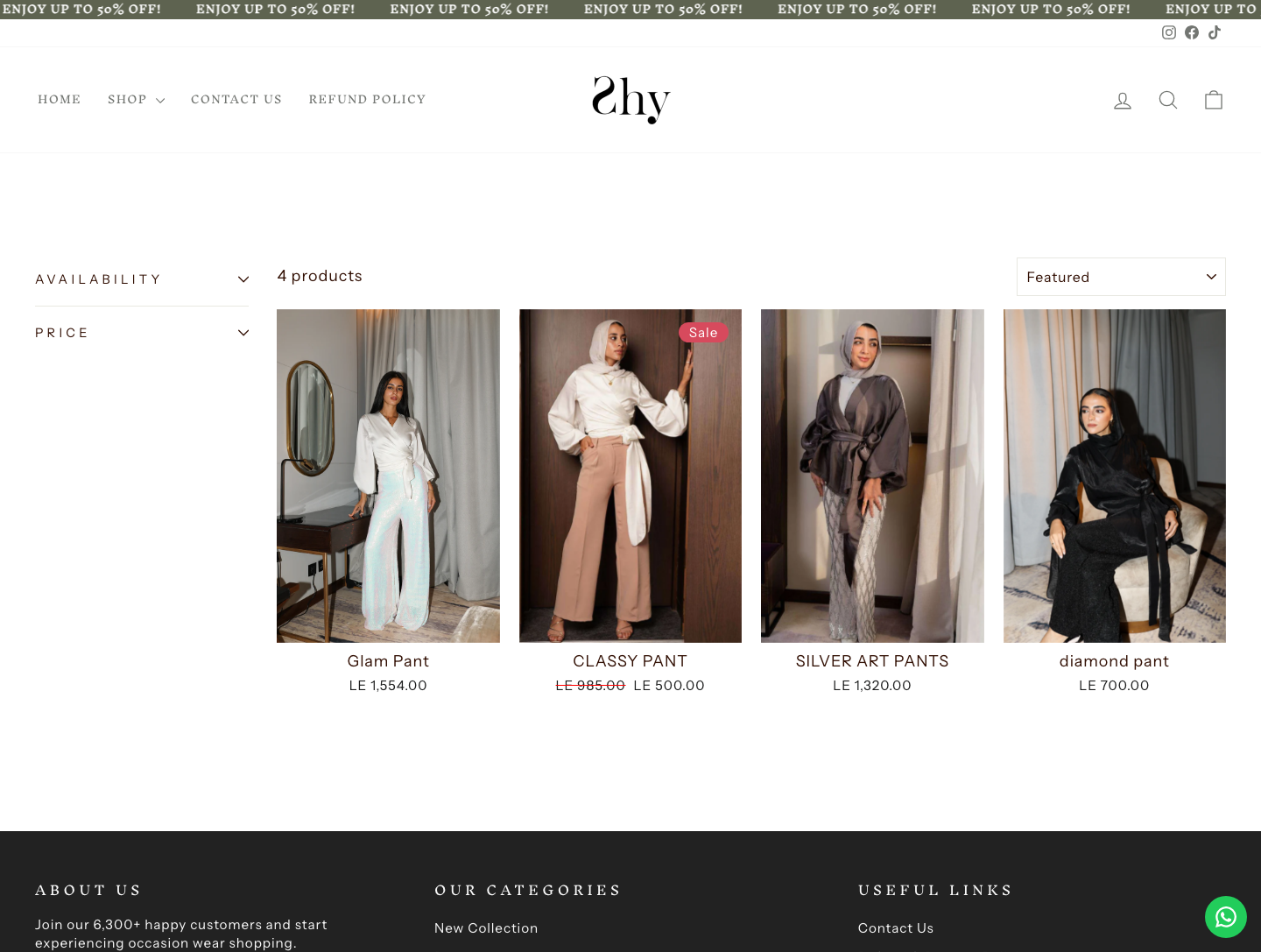
Pants
The Pants category extends the same shopping system across another product family, keeping navigation predictable as the catalogue grows.
- Product family separated into its own surface
- Predictable catalogue navigation
- Image-led product comparison
- Scalable structure for future items
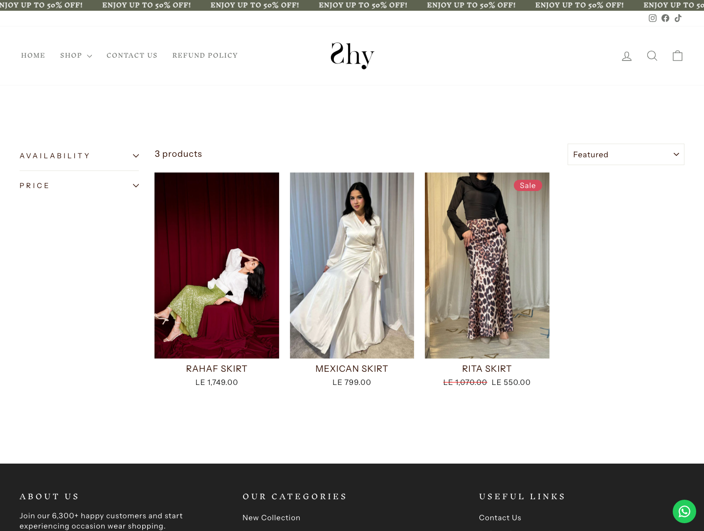
Skirts
The Skirts page gives shoppers a focused collection view with the same merchandising clarity used across the rest of the website.
- Focused collection browsing
- Uniform product-card system
- Clear category naming
- Easy movement between collections
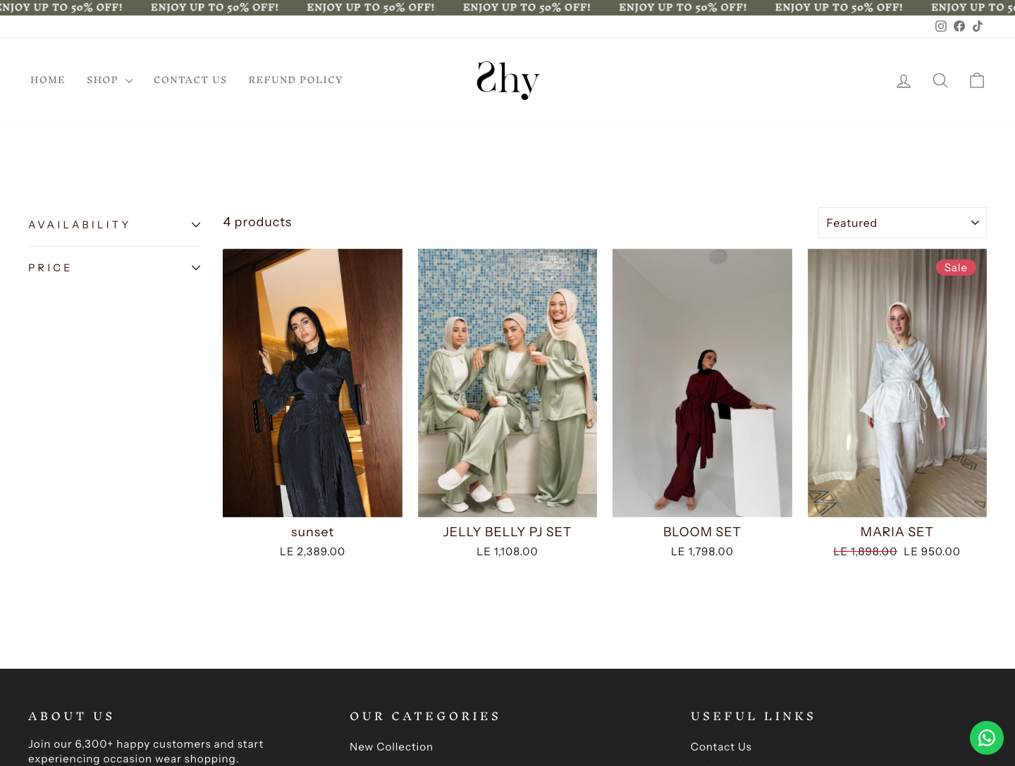
Sets
The Sets category supports outfit-based shopping, helping customers move from single items to complete looks.
- Outfit-oriented product category
- Simple discovery for complete looks
- Reusable catalogue layout
- Strong product imagery emphasis
Best Seller
A Best Seller surface highlights the strongest-performing products and gives new shoppers a confident place to begin.
- Curated high-intent collection
- Trust-building product discovery
- Fast access to popular items
- Sales-focused merchandising path
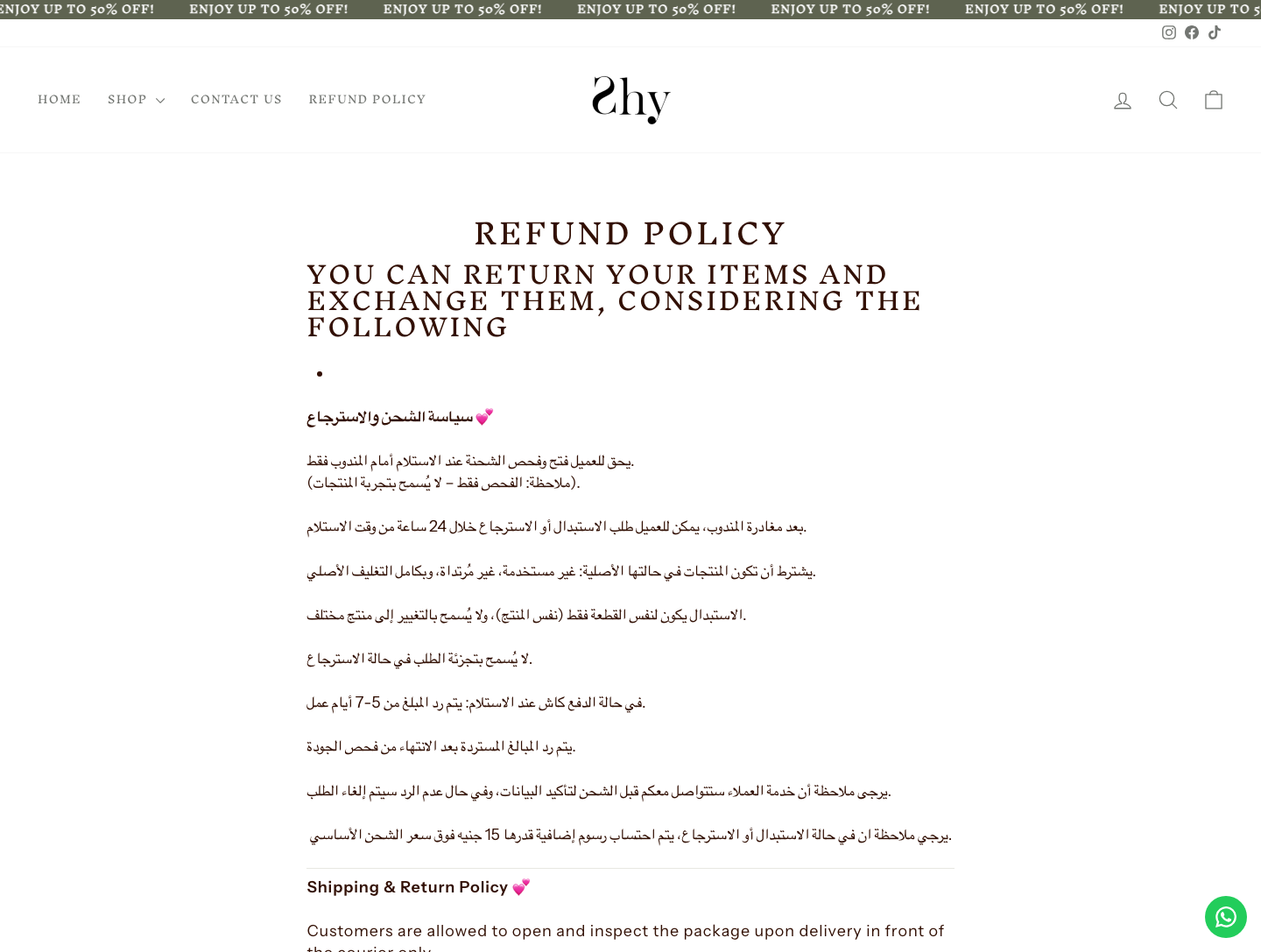
Refund Policy
The policy page adds the operational clarity an e-commerce site needs, answering refund expectations before they become support questions.
- Clear refund and exchange information
- Reduced friction before purchase
- Support-ready policy surface
- Trust layer for first-time buyers
The website gives shoppers a clean path into the collection: browse by style, discover what is new, trust what sells, and understand the policy before they buy.
How We Built It
From brand direction to a live storefront — our four-step delivery for the Shy Stores website.
We shaped the public website around a refined fashion storefront: clear hierarchy, polished product imagery and a shopping flow that keeps attention on the collection.
We structured the catalogue into practical shopping routes: dresses, blouses, pants, skirts, sets, new arrivals and best sellers.
We built the public website on Laravel Blade with scoped CSS and reusable visual patterns, then checked each category surface against the supplied screens.
We shipped the public site at shystores.com with a structure that can keep growing as the store adds more products and collections.
The Outcome
Shopping, cut clean.
Launching a public storefront?
We design and build public websites that make products easier to browse, trust and buy — with clear categories, strong merchandising paths and the policy pages customers expect.